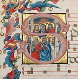
ome of the most beautiful artistic treasures created during the millennium we refer to in the Western world as the Dark Ages are books — usually of a religious nature, they were transcribed by hand in sumptuously precise calligraphy, illuminated with wonderfully colorful and imaginative borders, and graced with elegant inset illustrations that were themselves jewels of inspiration, meticulously set down with pen, brush and burnisher in inks, tempera and gold leaf on laboriously stretched and scraped sheets of parchment. When complete, these beautiful pages were bound in volumes large and small, from enormous folios that were easily read in the pulpits of candlelit cathedrals, to breviaries that nestled comfortably in the pocket of a monk's cassock. Lovingly preserved through many centuries, they are as wonderful to observe today as they were when they were fresh from the standing desks of the monks who gave them birth.
Happily, when Gutenberg reinvented movable type (first honors go to the Chinese, nearly 400 years before), the arts of the book were not lost, although as with many other crafts, artistic styles became simpler over time. Books continued to be made with fine leather bindings, though, and were often graced with the work not only of famous illustrators of the day, such as Aubrey Beardsley, Frederick Remington, and N.C. Wyeth, but of renowned artists as well. Type faces, borders and page layouts evolved under the skilful eyes and hands of artists and craftsmen who were proud to lend their talents to preserving the book as an art form. Even trade books were expected to display both clean design as well as covers that pleased and attracted the eye.
With the advent of the Internet, of course, costs of production have plummeted. Today, a design executed once can display on an infinite number of screens at no additional cost, and technology can supply a color palette hundreds of thousands of shades strong. It seems that the stage must be set for the artistic wonders of the Middle Ages to be duplicated again, not in only hundreds of books a year laboriously created across all of Europe, but in an endless number of pages crafted by the thousands of gifted individuals now able to display their talents before a waiting world at the click of a "save" key.
Except for one small detail: That hasn’t happened, has it?
Indeed, fifteen years into the ever wonderful, ever widening world of the Web, we are treated to hideously cluttered home pages at news sites that seek to cram as many topics onto a single screen as are spread across the first two sections of a newspaper. Even the stylish New Yorker, which has lovingly preserved its original type faces and layouts in its print edition with few changes (and those of equal flair) throughout its near-century of existence, presents an on-line cover to the world that would send founding editor Harold Ross into an apoplectic fit. And this despite the fact that it is a destination site, with no need to act as a Google magnet, or any reason to fear that visitors will refuse to invest an extra click to take them another page deeper into the riches they have arrived to enjoy.
Worst of all, of course, is Google, whose Spartan presentation (calling it a style would be oxymoronic) takes the functional beyond austere to the brutally mechanistic. Try any search at the Google home page and the results will make your eyes ache. The only tiny concessions to the concept of graphic design are the corporate logo, and the pale blue divider bar spanning the top of the page. Nothing, it seems, can compare in priority to appeasing the god of fast loading speeds, or rise to the visual importance of the raw display of data.
The Google Reader is even worse — a horrible hash of grids and bars (the latter originally displayed rounded corners rather than square, but even these insignificant extravagances were eliminated in a redesign intended to shave picoseconds off of the time Reader page takes to display). Compared to the tactile pleasure of reading a well-designed book, newspaper or magazine, staring at any Google page is a spiritually deadening exercise that encourages you to flee back to the printed page as quickly as possible, thinking dark, Ludditical thoughts all the way. One can’t help wondering why the marketing side of the Google house has never considered the cost to stickiness that sacrificing style for speed can exact.
Now, of course, we also have a brave new world of eReaders, with the Kindle holding pride of place among them (at least for now). Created by a book site (Amazon) expressly for the readers of books, one would have hoped that here might be found an electronic monastery within which the arts of the book might find refuge, and continue to flourish during these dark ages of digital design.
Perhaps they may yet, but for now, the situation appears bleak. The latest issue of the New Yorker included not so much a review as a defenestration of the Kindle’s aesthetics (or lack thereof — not that the page where it displays at the New Yorker has the right to throw any stylistic stones). The article begins by pronouncing the Kindle screen’s background color to be not just gray, but "a greenish, sickly gray. A postmortem gray" (some readers apparently find the Kindle 2’s display to be even worse: "Like reading a wet newspaper," according to one dissatisfied purchaser). Nicholson Baker, the author of the New Yorker review continues:
This was what they were calling e-paper? This four-by-five window onto an overcast afternoon? Where was paper white, or paper cream?…Where were sharp black letters laid out like lacquered chopsticks on a clean tablecloth?
Hardly a feast for the eyes, but at least all of the book is there to be read and appreciated, yes? Well, yes and no. According to Baker, what the Kindle is incapable of reproducing is as worrisome as what it can. The technology and standards that Amazon has taken the trouble to utilize and support are apparently not up to the challenge of displaying much more than block text, and in a limited number of fonts, at that. Baker goes on to note:
But say you’ve actually found the book you’re seeking at the Kindle Store. You buy it. Do you get what’s described in the catalogue copy? Yes and no. You get the words, yes, and sometimes pictures, after a fashion. Photographs, charts, diagrams, foreign characters, and tables don’t fare so well on the little gray screen. Page numbers are gone, so indexes sometimes don’t work….
When you buy the Kindle edition of Konrad Lorenz’s "King Solomon’s Ring," rather than the paperback version, you save three dollars and fifty-eight cents, but the fetching illustrations by Lorenz of a greylag goose and its goslings walking out from the middle of a paragraph and down the right margin are separated from the text — the marginalia has been demarginalized.
And what of the new Kindle DX, purpose built for newspaper and magazine display? Does it preserve the aesthetics of the newspaper experience, and deliver the multivarious pleasures of reading a quality paper? Sadly, no. Baker concludes that reading the news on the Kindle DX can be enjoyable, but only, "if you like reading Nexis printouts." In converting the physical page to the virtual, most of the endearing bits of the baby have, it seems, been thrown out with the bathwater:
The Kindle Times ($13.99 per month) lacks most of the print edition’s superb photography — and its subheads and call-outs and teasers, its spinnakered typographical elegance and variety, its browsableness, its Web-site links, its listed names of contributing reporters, and almost all captioned pie charts, diagrams, weather maps, crossword puzzles, summary sports scores, financial data, and, of course, ads, for jewels, for swimsuits, for vacationlands, and for recently bailed-out investment firms. A century and a half of evolved beauty and informational expressiveness is all but entirely rinsed away in this digital reductio.
an we guess why the visual arts have been so roundly ignored online? Bandwidth is hardly an adequate answer, given the amount of flash and video that increasingly clutter up sites of all types. Is it the fact that the Web has yet to attract graphic designers to take the hard edges off of html? If so, it would be hard to blame them, as a single Web page is so ephemeral and evanescent as to scarce warrant their attention. Or maybe it’s because no one has bothered to create standards to make the display of graphic arts possible other than as amateurish, cut and paste building blocks.
Or perhaps it is that artists realize that we don’t spend enough time on any given Web page to really notice a good piece of design. But what if, in fact, it’s because they suspect that we simply do not place the same value on art and design in our everyday lives that we used to, as Google seems to think?
I hope that’s not it, as it would be a sad day indeed when (if indeed it has not happened already!) the pleasurable practice of reading degrades finally into a utilitarian process of simple data acquisition on the fly. Reading can, after all, provide such an island of peace in the middle of our hectic lives that we should treasure all aspects of the experience, and not let the subtle appeal of well-conceived and executed page designs, attractive fonts, small, welcome embellishments, and careful color schemes pass away forever, unnoticed and unmourned, from the presentation of text.
But perhaps I am over-reacting. Perhaps we are simply transitioning through a necessary interregnum during which the basic electronic engineering work must be done to permit digital media to display (even) in elemental form, after which artists (yes, and marketing folks) will stream back into the process, and insist on leaving their creative marks upon our Web pages and our eBooks. After all (I hope), what else can they do, as the virtual continues to bully the physical out of its aggressively greedy way, and into extinction?
Is there an historical precedent for that expectation, or is it simply a vain hope that I harbor? As in so many other subjects, Thomas Jefferson may have left us a piece of fundamental wisdom that may guide us even in time like these. After the revolution, he reflected on the hard work and pragmatism demanded of the founding fathers in order to enable them to give birth to a new nation.
He summarized their sacrifices and hopes thusly: "We are soldiers, so our children can be farmers, so their children can be artists."
Perhaps in these still early days of our midwifing a brave, new digital world into existence, it is fair to grant that perhaps we must be software engineers first, so that our children can have the excitement of reinventing publishing online, so their children can be the artists that once again bring the ancient arts of the book back to the words of the future.
For further blog entries on Standards and Society, click here
sign up for a free subscription to Standards Today today!
Well, Andy, your profession invented the Billable Hour. That’s another manifestation of the same vanishing art.
In the software-and-digital world, there is this huge pressure for value. "I created it, so I must recover the investment by selling copies of it."
And it’s an external force, not an internal one. Microsoft would dearly like to give copies of Internet Explorer out with Windows 7, but in Europe they are not being allowed to. Does that represent progress ?
And yes, I do understand about the Billable Hour. Some causes will be Lost Causes, and you have salary and overheads to pay even if you represent a Lost Cause for a client. There really is no alternative.
It was a simpler time, when you could create for the sake of the joy of creation, and not be concerned with the Almighty Dollar.
And until we figure whether the American Dream really is "Life, Liberty, and the Pursuit of Happiness", we won’t be going back there.
Chris,
Good to see you back in this part of the woods, and welcome back.
I’m having a little trouble following your line of reasoning, though. FOSS, for example, is quite happy to take a back seat to proprietary software profit margins, and just look at the wealth of non-paid work on the Internet we’ve seen on other projects as well – like the Wikipedia, for example, or this blog (where I spend quite a bit of time on presentation, as well as text, even though, yes, I also need to think about billable hours) for another.
No, I don’t think that the Internet forces us to be more mercenary than the virtual world, and indeed, as the Wikipedia and FOSS show, quite the opposite. I think that it has more to do with priorities, and who ventured on to the virtual plane first – engineers, rather than graphic artists.
Personally, I’m hopeful that the artists of the world, and even just folks like me, that appreciate visual quality and appeal, will take an interest and make their desires known, and ensure that an on-line experience can be aesthetically, as well as intellectually, pleasing. After all, there’s nothing to lose, and everything to gain.
Best,
– Andy
Try telling that to those who were in charge of ATT in the early 1980’s, and who had to oversee its breakup into Bell Canada, Verizon, PacBell, SouthWest Bell, and so on.
When you engage in ‘doing stuff for nothing’, others come along and call it Discriminatory Pricing, and the US Government comes along and splits your business into smithereens.
And if not the US Government, then Neelie Kroes and her crew has a go.
This all makes the ‘corporate’ types very nervous about providing any product, performing any service, for anyone except Customers and Employees. And that nervousness is tearing apart our ability to teach anything useful to the next generation, to the schoochildren.
How do we stick it back together ?
Chris,
Well, on the Internet, you can clearly give a _lot_ away for free as a business model, and that’s more the problem vis-a-vis the above piece than any government oversight.
The problem with giving things away is that it makes you incredibly cost conscious, and no surprise there, which doesn’t leave a lot of budget for aesthetics, or a lot of screen room for graphics (as compared to advertising).
Even patents are an issue – guess who owns some of the technology for rendering fonts? And it’s expensive to add new ones to the on-line type case to make Web pages more interesting and fun to view.
Best,
– Andy